


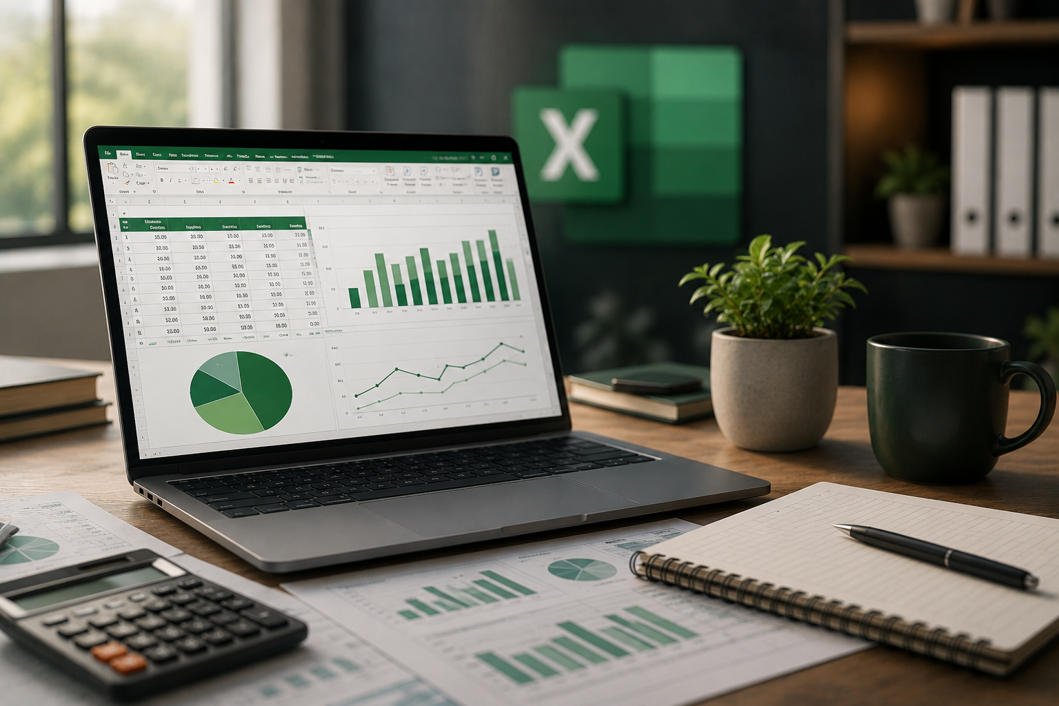
Excel is more than a place to enter numbers and perform calculations. With tools like PivotTables, charts, and data analysis features, you can turn large amounts of data into clear information that helps you understand what is happening and make better de
Many people start using Excel in a very simple way: a table, some numbers, and maybe a few calculations.
There is nothing wrong with that, but it is only a small part of what Excel can actually do.
The real value of Excel starts when you move from asking, “How do I organize this data?” to a more important question: “What is this data telling me?”
That is where data analysis becomes useful.
Imagine you have a file containing hundreds or even thousands of sales records.
You might have the product name, sales date, quantity, price, branch, and employee responsible for each sale.
All the information is there, but simply looking at the table will not easily tell you which product sells the most, which month performed best, or whether one branch is doing better than another.
This is where Excel’s data analysis tools make a real difference.
One of the tools I find especially useful when working with large amounts of data is PivotTables.
Instead of creating many different formulas to calculate every result, you can use a PivotTable to summarize your data and look at it from different perspectives.
For example, you can quickly see total sales by month, compare the performance of different branches, or identify the products generating the best results.
You can also change the way the information is displayed without rebuilding the entire report from the beginning.
Excel also gives you tools such as Pivot Charts, Slicers, and Timelines, which make it easier to explore and present the information.
Sometimes your table is perfectly organized, but the person reading the report does not want to spend several minutes comparing rows of numbers.
This is where charts and data visualization become important.
The right chart can communicate a trend in just a few seconds.
For example, a Line Chart can help you follow changes in sales over time, while a Column Chart can make it easier to compare departments, products, or categories.
But the goal is not to fill a report with as many charts as possible.
A useful chart should answer a clear question.
Excel provides different chart types, dynamic charts, formatting options, and tools that can eventually be combined into professional dashboards.
Another simple but powerful feature is Conditional Formatting.
Instead of manually searching through hundreds of values, you can ask Excel to highlight the results that deserve your attention.
For example, you might highlight values that have reached a target, results that are below expectations, or important KPI indicators.
This makes the worksheet easier to read and helps important information stand out instead of getting lost among hundreds of similar numbers.
In the end, being good at Excel is not about knowing the largest number of functions or tools.
What matters more is knowing when to use them.
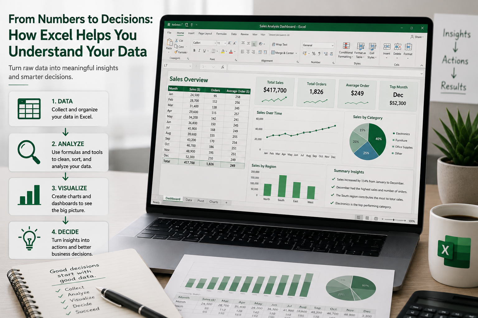
You might start with raw data, clean and organize it, use functions or PivotTables to analyze it, and finally present the results through a chart or dashboard that someone else can understand easily.
At that point, Excel becomes much more than spreadsheet software.
It becomes a practical tool for turning data into useful information and better decisions.

Link copied
Rate this post
Please log in to rate and comment. Login
Please log in to rate and comment. Login




No courses found.
0 Comments
No comments yet.